 Beyond the Pale
Julia ... thanks for talking to 'Beyond the Pale' and its thousands of readers all round the world. May I start by asking how you came to be involved in working on Procol album art, tee-shirts, programmes and stage backdrops?
Procol HarumBeyond
|
Beyond the Pale
Julia ... thanks for talking
to 'Beyond the Pale' and its thousands of readers all round the world.
May I start by asking how you came to be
involved in working on Procol album art, tee-shirts, programmes and stage backdrops?
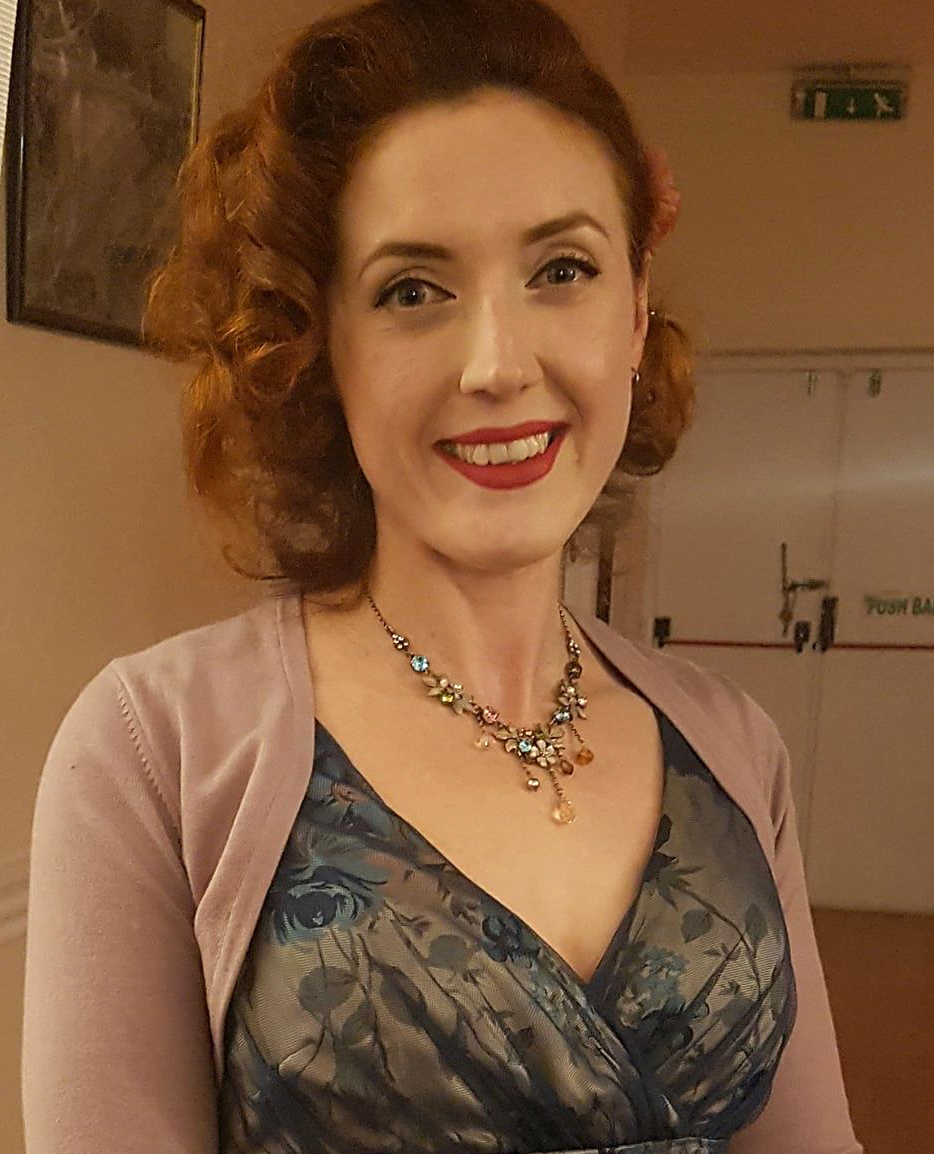
Julia Brown
I met [Procol
Manager] Chris Cooke many years ago through our shared love of motorcycles. I
believe it was in a pub in
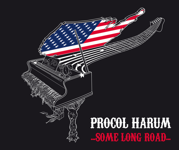
As we got to know each other, eventually we got chatting about what kind of work we both do, and he initially approached me to work on some stage backdrops and tee-shirt designs – the … Some Long Road … artwork – when the 2012/13 tours were kicking off. The rest is history.
What
other kinds of work do you do?
I've always drawn and painted, sold a bit of it when I came out of Uni., and I'm starting to focus much more on this side of my work
again now; but over the years I've developed my graphic design and illustration
skills. They are more commercial outlets for my creativity, I suppose –
you have to pay the bills – but I enjoy the different disciplines, and
the different problems you have to solve with each specialism.
I work closely with a few private clients – entrepreneurs and business owners; a one-to-one graphic design service for people who don’t want to approach big agencies. I design a lot of book covers (and other printed marketing), and create bespoke illustrations (such as avatar portraits, caricatures and book characters).
 What’s
your background as an artist, in terms of training and tastes?
What’s
your background as an artist, in terms of training and tastes?
Initially, sitting around the kitchen table with my mum when I was little, painting, drawing, and getting covered in glitter! My mum is creative: she went to art school and painted when she was younger, and my dad is as well – but more so in a technical/engineering way. He designed and built his house; and he loves woodwork and making things. So I have a good pedigree, I suppose.
I was very fortunate to go to a school with excellent
teachers and well-funded art department. Through my GCSEs and ‘A’
Levels, I was really encouraged to push myself – afterwards continuing to
a BA Hons Fine Art (painting) at
My tastes are varied – and not just painting: I love photography, sculpture, ceramics, printmaking. I don’t think you can pin it down – inspiration comes from all sorts of places. And sometimes the art I would buy is not necessarily the same as what inspires me or provokes thought. I worked a lot in oils for a while: as a figurative painter (and one who loves painting humans) I don't think you can really ignore artists like Rembrandt, Velazquez and Goya. Their work is incredible and taught me a huge amount about painting from a technical point of view.
I am also heavily influenced by the Fin de Si�cle/Belle �poque periods – when Art Nouveau was also popular. Late 19th Century portrait artists such as Sargent and Whistler are favourites, among others – who, in turn, were influenced by the Oriental art (notable print-makers include Hokusai and Hiroshige) coming into Europe at that time. I’m also a great fan of graphic artists and illustrators such as Mucha, Beardsley, Rackham and Heath Robinson – and Gris Grimly recently. I do count more contemporary artists such as Paula Rego and Jeff Wall among my influencers, and I love both Cathy de Monchaux and Rebecca Horn’s sculpture work – endlessly fascinating.
Your
own work combines digital and old-school techniques: what’s your
favourite medium to work in?
Can I say both?! They’re both such different disciplines, and yet
they cross over in a really exciting way for me.
For more commercial work, working digitally has all the obvious benefits:
speed, ease of manipulation of the image, the ability to 'draw' and 'paint'
without the need for large walls or tons of paint (you would not believe the
amount of paint you need to cover an eight-foot canvas!).
 Supply to the client, or creating prints is obviously easier and quicker.
And there are some really powerful digital packages these days that give me the
ability to work with 'brushes' (and other tools) which react in a very lifelike
way – that's really exciting to
experiment with.
Supply to the client, or creating prints is obviously easier and quicker.
And there are some really powerful digital packages these days that give me the
ability to work with 'brushes' (and other tools) which react in a very lifelike
way – that's really exciting to
experiment with.
But you can't beat the immersive feeling of connecting mind and body with real paint and bushes, the smells, textures, and organic way that the paint behaves. It's much more visceral – works from a much more primal part of yourself – than using a computer. That’s why I wanted to include some hand-finished elements in watercolour and silver leaf when I created the Wreck of the Hesperus prints – so I felt more connected to the work.
Your
recent Procol work has made interesting use of motifs from their early
illustrators. Was that the band’s decision, or yours?
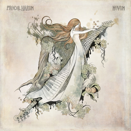
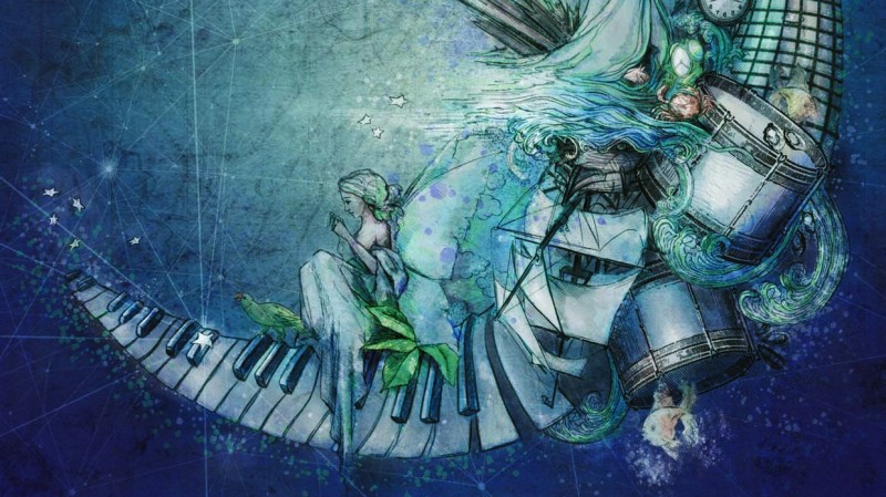
When Chris approached me about creating Novum, he suggested using Procol’s eponymous album cover as a
starting point. It was the Fiftieth Anniversary, and felt like a full circle
– an opportunity to underline how far the band has come, and their
achievements. I kind of took that and ran with it, selecting my favourite
little snippets from some of the other albums down the decades to add in as
little ‘nods’. I also figured it might be a fun exercise for fans
– ‘spot the reference’.
That ended up continuing into the artwork for Still There’ll Be More. It seemed even more appropriate for a
boxed set collection.
 You've
built on
You've
built on
In the end – yes! It started out as just creating the letters
necessary for the titles, but then I designed the souvenir programme for the
Fiftieth Anniversary tour and I ended up needing pretty much all of the
alphabet!
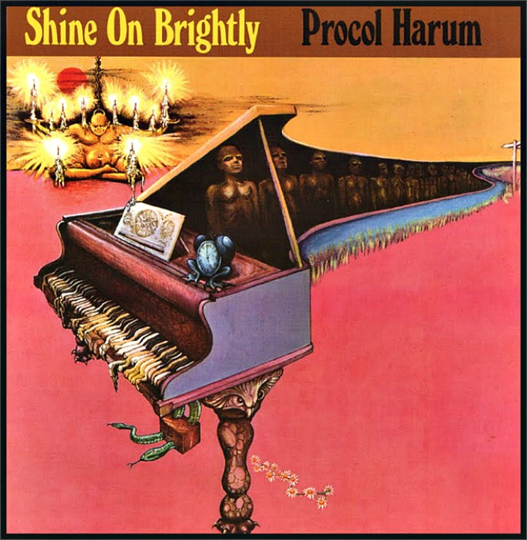 That
little frog-clock, from the George Underwood
Shine on Brightly album, seems to fascinate you: fans who bought the
Fiftieth Anniversary programme will have noticed that you changed the time on
it … what was the thinking there?
That
little frog-clock, from the George Underwood
Shine on Brightly album, seems to fascinate you: fans who bought the
Fiftieth Anniversary programme will have noticed that you changed the time on
it … what was the thinking there?
Yes, I’m very fond of him –
he’s become a favourite little character. He appears on the Wreck of the Hesperus (the Still There’ll Be More box set
artwork) as well.
I honestly can’t remember whether it
was Roland or Chris Cooke (or both together with the aid of a pint, perhaps?)
[modesty forbids, etc ... Ed.] that came up with arranging the hands so it showed ‘20:17’ –
to indicate the year of the Fiftieth Anniversary. A small stroke of genius that
alas, I cannot claim as my own.
If you
could have a framed fine-art print of one of the band’s earlier sleeves
on your own wall – like the ones of your own work (here,
and
here) that you’ve made
available – which album would you choose, and why?
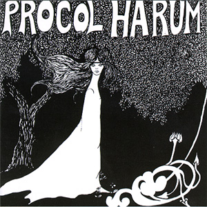
That’s a good
question. I would have to go for the 1967 Procol
Harum cover. It’s very much of its era (which I like), and I love the
black and white graphic combined with the nod towards Art Nouveau. It’s a very strong image. And a bit weird and
unsettling as well – it sort of reminds me of
Edvard Munch’s The Scream for some reason.
Can
you tell us a handful of your favourite album covers by other artists …
and what are the prime ingredients of a good cover?
�
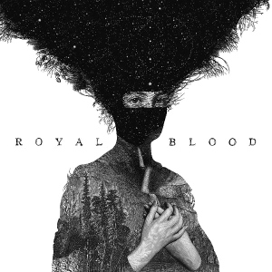
� Dan Hillier’s artwork for the 2014 self-titled Royal Blood album – I love the
illustration style and the little details, and the use of – literally
– white space. It really stands out across a room, which is important.
�
�
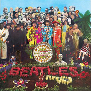
The Beatles’ Sgt
Pepper’s Lonely Hearts Club Band has to be up there as an all-time
classic, of course – Jann Howarth and Peter Blake understandably won a
Grammy for their artwork. It’s just so interesting to look at.
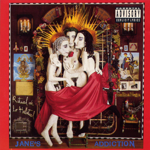
� � Ritual de Lo Habitual (1990) by Jane’s Addiction is another favourite. The cover artwork is by the band’s singer Perry Farrell. I love the little sculpted figures, and the way it resembles a shrine/icon collection. I’m not Catholic (or even remotely interested in religion) but I am very interested in shrines as an expression of personal emotion, and Catholic and Orthodox icon art. The references (and again the details) on the cover fascinate me – and the interest continues into the interior of the album.
 |
 |
 |
I could go on forever with this, but all three have icon status in my mind:
� they are as interesting and as captivating today as they
were when they were released
�
�
they all stand out a mile and couldn’t ever be
confused with any other album
�
�
they are all original.
There are so many album covers that are parodies or
full-on copies of previous releases. It’s always good to see something
completely original (the irony of what I’ve just said is not lost on me
here, after creating Novum!)
How
much of a design constraint is it, that the image has to work on a 12”
album cover and on a 12 cm CD cover?
 Oddly enough I like
working in square format, so that’s not a problem.
In terms of size,
one of the things about working digitally is that I can zoom in to work on
details – and zoom right out to monitor how those details look at different
sizes/distances.� It’s only the
same as seeing a 12” vinyl from the other side of a record shop –
the CD just happens to be smaller when it’s actually in your hand.
Oddly enough I like
working in square format, so that’s not a problem.
In terms of size,
one of the things about working digitally is that I can zoom in to work on
details – and zoom right out to monitor how those details look at different
sizes/distances.� It’s only the
same as seeing a 12” vinyl from the other side of a record shop –
the CD just happens to be smaller when it’s actually in your hand.
The cover has to
grab your attention and differentiate itself from the others surrounding it
– whether it’s right in front of you, or a tiny thumbnail on a
webpage. So that’s definitely a consideration when composing the image.
What
music do you listen to yourself, when working, or for pleasure?
 I’ll have to narrow
it down a bit I suppose! My tastes are massively wide and varied, but I suppose
I like music that makes me think, lyrically, or conjures a strong emotional
response. It ranges from Mozart, Vivaldi and Beethoven, to Led Zeppelin and
Fleetwood Mac, Bowie, Kate Bush, Foo Fighters, PJ Harvey, Underworld, Bj�rk, and much more contemporary stuff such as The Joy
Formidable, Wild Beasts, Tune-Yards, Christine and the Queens, the Staves
– I’m loving London Grammar at the moment as well.
I’ll have to narrow
it down a bit I suppose! My tastes are massively wide and varied, but I suppose
I like music that makes me think, lyrically, or conjures a strong emotional
response. It ranges from Mozart, Vivaldi and Beethoven, to Led Zeppelin and
Fleetwood Mac, Bowie, Kate Bush, Foo Fighters, PJ Harvey, Underworld, Bj�rk, and much more contemporary stuff such as The Joy
Formidable, Wild Beasts, Tune-Yards, Christine and the Queens, the Staves
– I’m loving London Grammar at the moment as well.
It does depend on
what I’m doing work-wise. If I need to concentrate, or I’m writing,
I prefer silence – if I’m running, I’ll put some
‘banging’ dance tunes on with a bit higher BPM. If I’m
painting or working on something creative, it can be whatever my current
earworm is, but solid favourites are Arcade Fire,
Florence and The Machine and Goldfrapp – all of whom I’ve been
lucky enough to see live over the last few years.
BBC Radio 6 Music
is great for discovering new artists and hearing music that is slightly on the
‘outer fringe’, so I dip into that every so often as well.
I have to admit,
working on the research for the Still
There’ll Be More artwork massively opened my eyes to Procol
Harum’s music. I’d probably heard a few of the
‘biggies’ over the years, but delving into the back catalogue in
more detail opened up a new respect and admiration for their music.
What
were your impressions of Procol live, and meeting the fans?
Seeing Procol at
the Bridgewater Hall in
What
sort of feedback are you getting to your amusing and candid weekly e-mail
bulletins, and how can people sign up for them?
 One of the reasons
I started writing my bulletin e-mails is: the overriding feeling I get from
people, when I chat to them about being an artist – and them potentially
buying art – is that they feel a bit mystified and intimidated by the art
establishment – especially in the
One of the reasons
I started writing my bulletin e-mails is: the overriding feeling I get from
people, when I chat to them about being an artist – and them potentially
buying art – is that they feel a bit mystified and intimidated by the art
establishment – especially in the
The feedback
I’ve had is along the lines of: “I’d love to buy art, BUT I feel a bit overwhelmed / looked
down my nose at, walking into a gallery and asking about the art and the
artists…”
There’s a snobbery attached to
the art world – I’ve experienced it even coming up through the
ranks of a Fine Art degree, agents and galleries. If that snobbery makes people
who love and appreciate art feel like they can’t buy it without it being
a harrowing experience, then that’s really sad – and completely
unnecessary!
It should be a
fantastic experience connecting with a piece of art so much that you want it to
be part of your life and your home.
So, my e-mails are
a way of helping people get an insight into me and how I work, and also when I
have new work available to buy. They are free to ask questions or e-mail me
back if one of my comments sparks something inside them – in fact
I’d encourage it, and so far, I’ve had some really positive and
interesting responses – it’s brilliant, from my point of view, to
get feedback from those who’ve bought my work or like what I do –
from all over the world as well.
If anyone’s
interested, visit
my website here
and just fill in the form.
How do
you balance time between the creative side and the business of (for instance)
corresponding with fans and sending fine-art prints of your work all over the
world?
I have to be really
disciplined! I learnt quickly that running your own business and working from
home – however fantastic that is – does not mean swanning around in
your pyjamas at 11am. Even as an artist.
I have a schedule
and I work out blocks of time within each week for different areas of my
business. I don’t answer my phone when I’m working (unless
it’s pre-arranged or an emergency) – it’s a complete
distraction, and I have certain times of the day when I check e-mails.
It’s the best
way I’ve found of making sure I can concentrate on my painting, or client
work, without interruption. As my other half will vouch, I get pretty grumpy if
I’m broken off from my creative work!
Can
you tell us some of the nice things fans have said about your Procol work?
Well, I have to jump right to the juicy namedrop here really, don’t I? I had a very touching e-mail from none other than Geoff Whitehorn when he received one of the limited edition Novum prints I created. I know he won’t mind me sharing his message:
“Thank you so much for the print, and, in fact, the beautiful artwork in the first place. I’m just looking round for a decent framing shop, and then all that’s left to do is to decide where to display it to best effect. You captured the spirit of PH wonderfully, so thanks again.”
![]() And
lastly … Procoholics are always reading between the lines and looking for
patterns. The early albums were illustrated by
the partner of the
band’s
then wordsmith ... so can you clarify your relationship to Novum lyricist Pete Brown?
And
lastly … Procoholics are always reading between the lines and looking for
patterns. The early albums were illustrated by
the partner of the
band’s
then wordsmith ... so can you clarify your relationship to Novum lyricist Pete Brown?
Haha!
No – (as far as I’m aware) Pete Brown isn’t a relative. In fact, I don’t think there are any ‘Pete’s or ‘Peter’s in our Brown family at all.
I’m sorry to disappoint, but there’s no spooky pattern!
Thanks, Julia!
|
Features at ‘Beyond the Pale’ | Buy Novum artwork (signed print) | Buy Still There'll be More artwork (hand-embellished) |
|
PH on stage | PH on record | PH in print | BtP features | What's new | Interact with BtP | For sale | Site search | Home |